Studio Essentials: My Paints
A haircut. Wine. Oil Paints. What do all of these have in common? In my opinion, they are three things that are worth the splurge. While there are okay haircuts, decent wine, and sufficient oil paints, I’ve found when purchasing these three things that a few extra dollars produces exponentially better ends results.
Over the past couple of years, I have tested out a number of different brands & colors of paint on my palette and found some real winners that I truly cannot do without.
BRANDS: There are a few brands of oil paints have stuck with me over time, and those I can rely on for consistent color and quality. Williamsburg Oil Paints is the gold standard for me. Their paints are highly pigmented, so a little goes a long way! Because I only have to use small amounts of their paint at a time, I find that spending a little extra on some of their paints okay because I know they will last pretty long.
Holbein Artists' Oil Colors & Gamblin Artists' Oil Colors are both tied for second. They are slightly less expensive than Williamsburg, but have a solid range of colors that make a big impact on my palette.
I have a love/hate relationship with Winsor & Newton paints. When I first started painting, the W&N paints were totally sufficient. But once I started reordering some of my favorites, I was really disappointed in how lightly pigmented they were. I swear I had to use half of a tube at a time! There are a few colors that have stayed consistent, but otherwise I use any of the other three brands to fill my palette.
COLORS: There are literally a million different oil paint colors under the sun. But I’ve found a couple of my all time favorites that always have a spot on my palette.
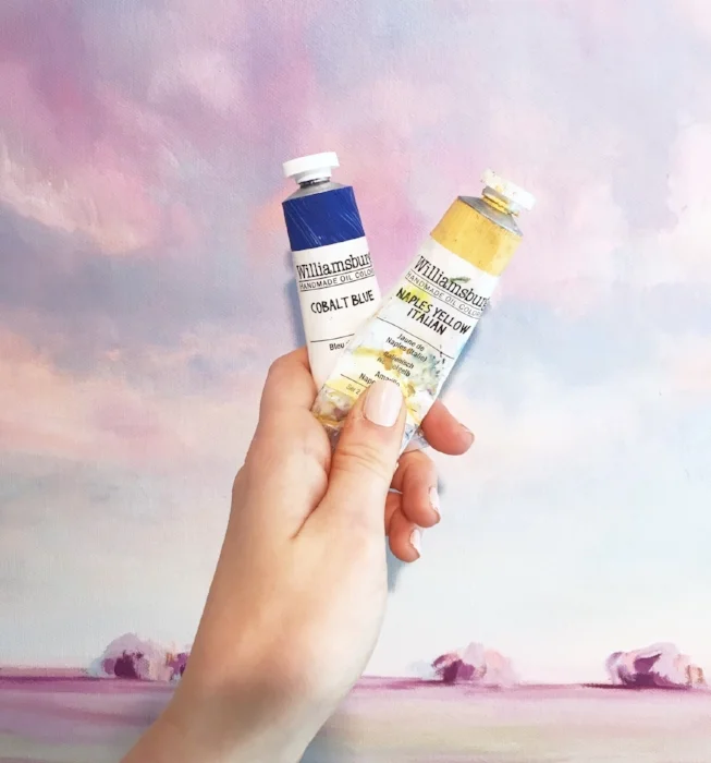
Williamsburg Cobalt Blue: I kid you not, this color completely changed my paintings. If you look outside at a blue sky, this is the color you would see. It is versatile and can be used to paint a sky from any time of day, from sunrise to sunset.
Williamsburg Naples Yellow Italian: I think Williamsburg found a way to capture the color of sunlight and put into a paint tube. This is the least yellow-y yellow paint. It is soft and glowy, and not garish at all.
Holbein Prussian Blue: Almost all of my shadowed areas have at least a touch of this color. Prussian blue is a dark, inky and deep blue. It has a cooler tint, so it is perfect to create areas of shadow, or in areas that need to fade into the background.
Williamsburg Titanium White: Give me this paint or give me death. There is no other white paint like it, and I buy the big tube of it, two at a time. This is an invaluable paint that is worth every penny!
Williamsburg Cadmium Red Medium: While this is one of the more expensive paints in my palette, it also goes the furthest. The smallest of this orangey-red adds so much character to any paint it is mixed with. It is the perfect addition to grassy green to make it look a little more natural, and when mixed with white, it adds the perfect touch of pink without it looking like bubble gum.
The quality and accuracy of the colors I paint onto my canvas are vital to the end result. These are just a few of my favorites, but I always love learning about new materials, brands and mediums! If you have any products you think I should try out, comment below!
