Meet My Painting: "Blue Daze"
Is there anything more invigorating, more life-giving, and more promising than a blue sky? There is a crispness, a life-force, and a promise with a nearly-cloudless day. There is nothing hindering the sun from shining, so why should anyone feel hindered from accomplishing something great? This feeling of assurance that comes from a bright blue sky is the reason and the purpose behind my next painting in the ‘Meet My Painting’ Series: Blue Daze.

This painting was inspired from the photo below that I took this past Thanksgiving out at the Farm. When I look at this photo, I can imagine myself right there, on the porch, watching my cousins and siblings play corn hole and taking in the warmth fuzzies of my favorite holiday on a crisp November day. The building in the distance is the bunkhouse that my parents build a couple years ago, which deserves its own post because it is just that well done.
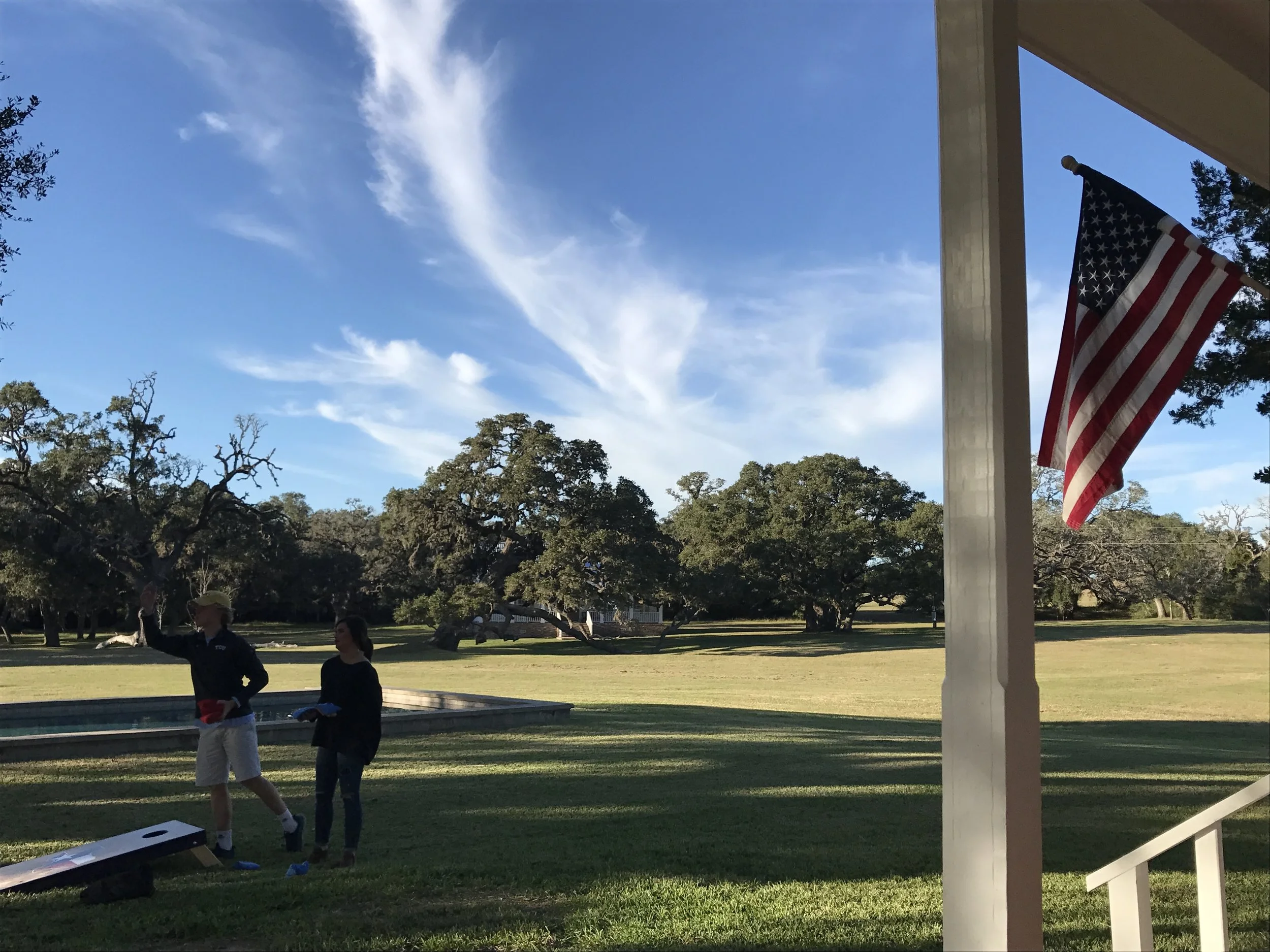
In this moment, everything was right, and I knew when I saw the sky above that it was one I wanted to remember. Not only was this landscape scene aesthetically pleasing, I wanted to catalog this moment in time and the feeling of ‘home’ that surrounded me.
Beyond capturing this sliver of time, I wanted to be bold and bright and honor to the “blue-ness” of this day’s sky. You won’t find any washy, soft baby blues in this piece. Instead, I used deep cobalt blues, bold cadmium greens, and even threw some teal in there. Without trying, I limited my palette to blues and greens, but allowed myself so much freedom within my constraints. And I had so much fun!!!
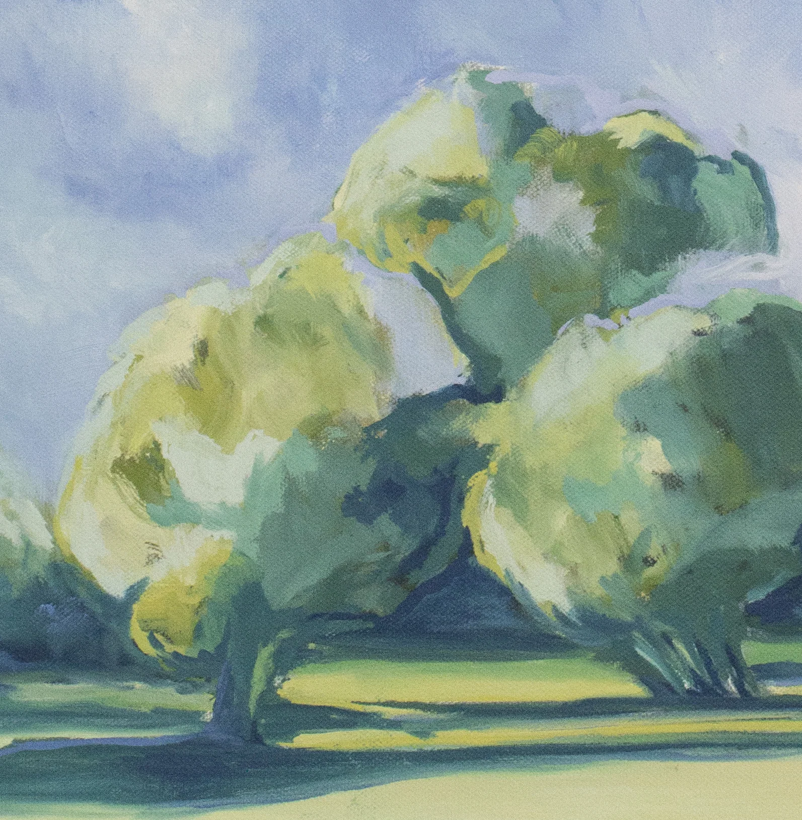
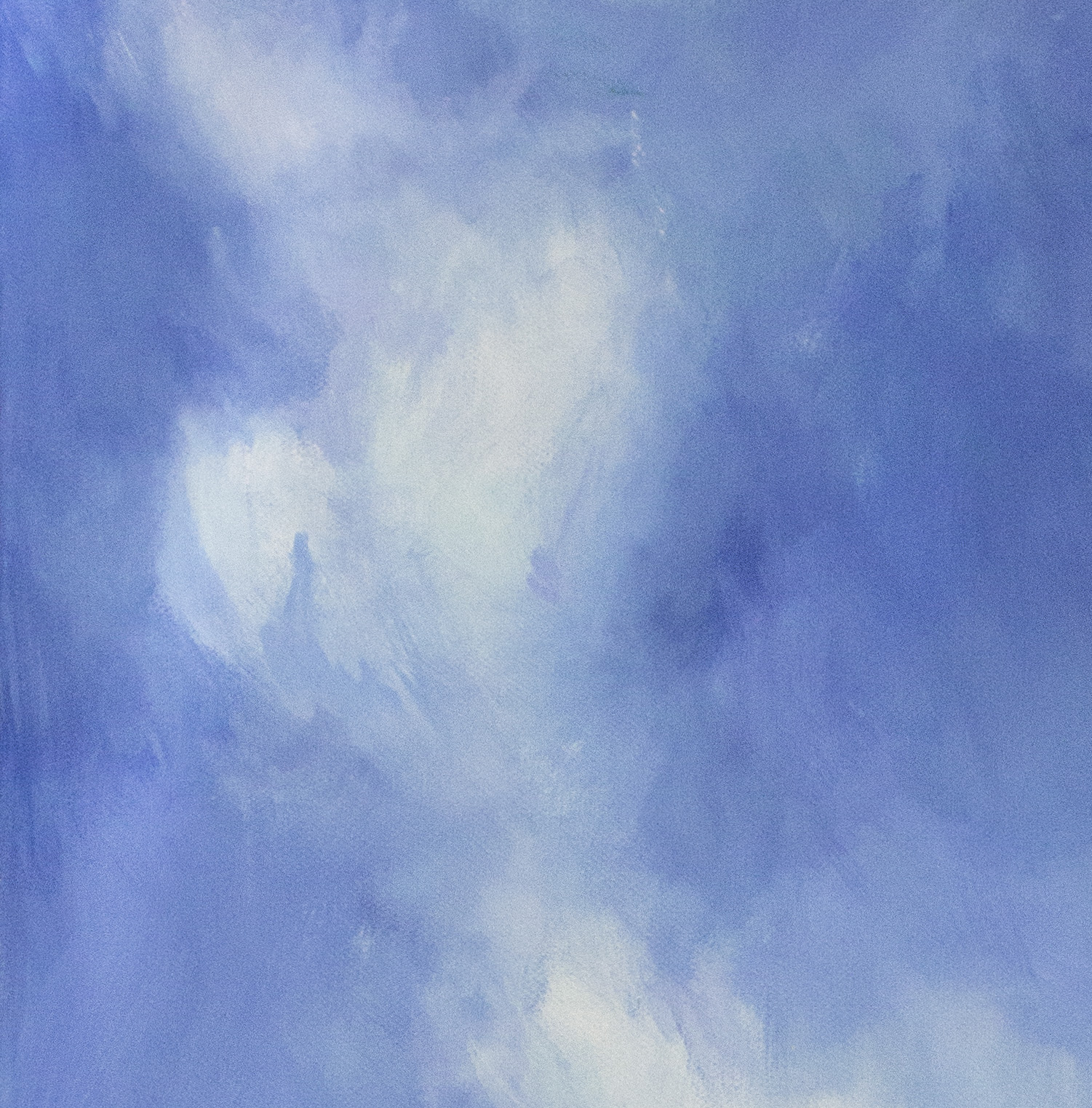
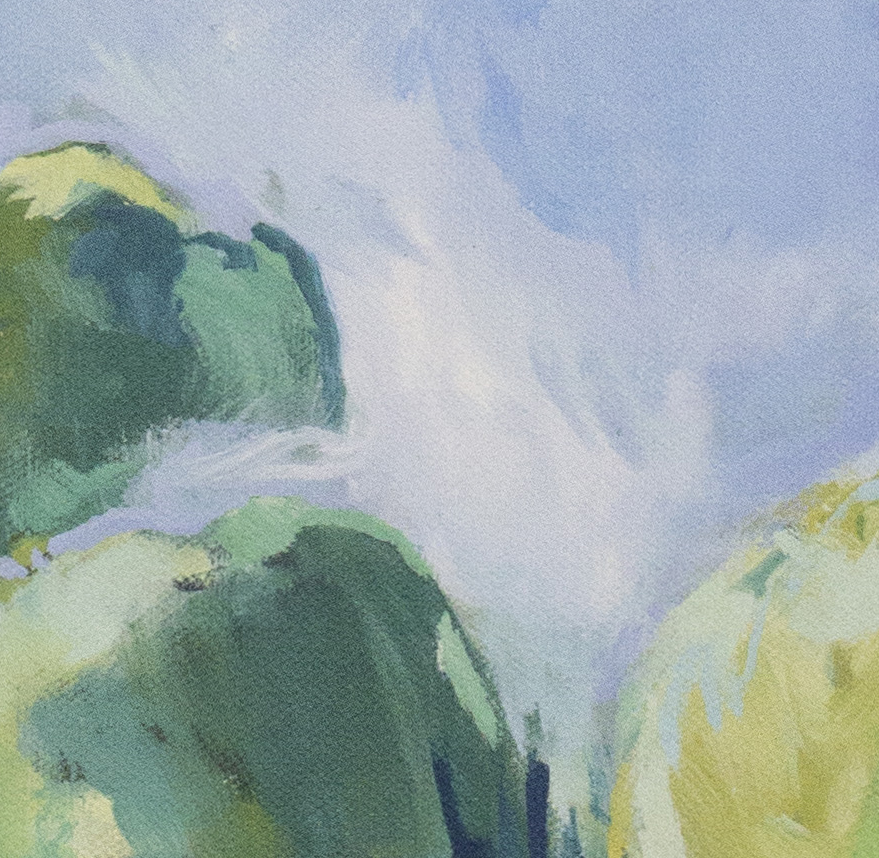
Intermingling aspects of both the sky and land, and added areas in the trees where the sky reflected onto the tree line enhanced my stylized approach to this painting. I worked quickly in thin layers, letting each layer dry before adding the next, so the paint never got too mushy and squishy on the canvas. The true white of the clouds made me nervous at first because I usually stay away from using colors straight from the tube, but for whatever reason, it worked this time. When I mixed the teal on my palette, it looked a little cheesy, and I almost stopped myself from adding it for fear of messing the whole painting up. To my surprise, that worked out too!! In the end, I did a couple of things with this painting that were outside of my comfort zone, but I’ve never been happier that I pushed myself in these areas of discomfort.
If I am being completely honest, I genuinely love how this painting turned out. Every now and then I finish a painting and think to myself, “I need to go in this direction.” I love how free, loose and unfussy it is. It is representative of an outdoor scene, yet has areas where I bend the rules of realistic landscape painting. The vertical format of the painting always allows me to fit in alllll the sky and just the right amount of land & trees. It would look great in a funky, mid-century modern home with lots of other bold colors. I can also see it as a great statement piece in a more neutral colored room…so many possibilities! And (bonus!) I have a great framing option for this one - a gold floating frame! I love how the brightness of the gold compliments the bold color palette. Sigh. So bright and so fun.
Now, whenever I look at this painting, the color of my sky is always blue. This painting takes me back to this moment in time - it takes me home.
